Why Accounting Firms Struggle to Convert Web Visitors to Clients

Season 8 Nbc GIF by The Office
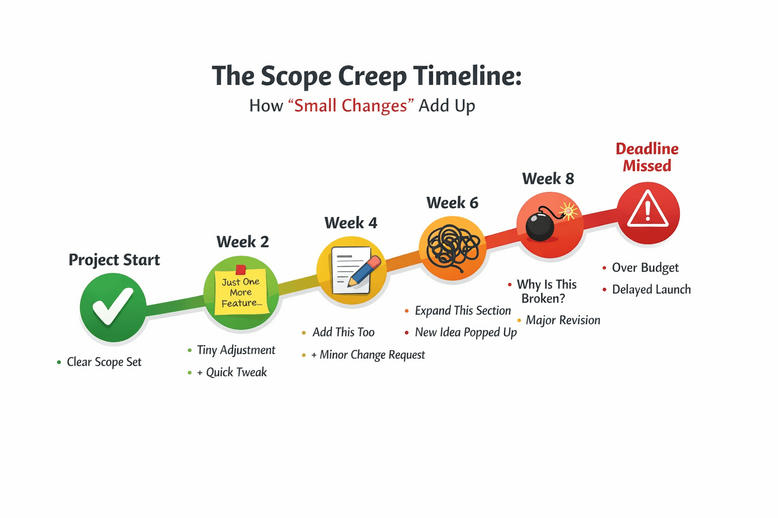
TL;DR
Most accounting websites convert only 2-5% of visitors.
The problem isn't traffic. It's trust.
Visitors need four things before booking: credibility (modern design, clear focus), expertise (specific problems you solve), risk reduction (pricing context, clear process), and personal connection (real photos, human stories).
Common mistakes: vague navigation, generic service pages, long contact forms, no reason to act now, and hidden pricing.
Quick fixes: cut form fields to name and email, add pricing ranges, explain your process clearly, and check mobile experience.
Improving from 2% to 4% conversion doubles your leads without spending more on ads.
The Core Challenge: Trust Takes Time
Your accounting firm's website gets traffic. But most visitors leave without contacting you. You're not alone. Most professional services websites convert between 2-5% of visitors. But you can do better if you understand why people leave.
Accounting services need unusual trust. Clients give you access to financial records. They share business data. They hand over private information. This isn't a quick buy. It's a big decision.
Someone lands on your website. They're doing research. They might compare several firms. They check options over days or weeks. Or they're trying to understand what they need. Your website should support this process. Don't push for quick action.
Most accounting websites work like business cards. List services. Add credentials. Include a contact number. This misses what clients actually need to move forward.

American Psycho – Business Card Scene
What Visitors Need to Test Your Firm
Trust builds as someone spends time on your site. Here's what matters at each stage.
Initial Impression (First 5-10 Seconds)
Visitors form quick judgments before reading anything:
Website quality and modern look. Old design suggests old practices.
Clear focus. Do you specialize or serve everyone?
Quick credibility signals. Certifications, member groups, and client logos.
The goal isn't to close a sale. You need to pass the first test. Then visitors keep exploring.
Showing Your Expertise (First 30-60 Seconds)
Visitors move past first impressions. Now they look for proof. Do you understand their specific situation?
Statements like "we handle taxes for small businesses" don't help. Hundreds of other firms say the same thing.
What works better:
Talk about specific problems. Don't list services. Describe real situations. "We work with contractors who struggle with quarterly estimates and 1099 or T4A management." This speaks to the right people right away.
Share helpful content. Articles, guides, or resources that answer common questions. This shows you know your stuff. No sales pitch needed.
Explain your process. How do you work? What's your typical approach? How do you communicate? This helps people picture working with you.
Making It Feel Less Risky

Many firms lose interested people at this stage. The visitor is hooked, but doubts creep in. They worry about cost. They fear wasting time. They're unsure about fit. They feel anxious about commitment.
Pricing guidance helps a lot here. You don't need exact prices for everything. Accounting work varies based on complexity. But some context helps people decide if you're right for them.
Try something like: "Small business monthly bookkeeping runs $400-1,200. It depends on transaction volume and complexity." This gives enough information without making false promises.
The tradeoff
More pricing info attracts price-focused prospects. But it also filters out people outside your range. This saves time for everyone. Less pricing info may appeal to bigger-budget clients who expect custom proposals. Pick what fits your target market.
Low-risk entry points help, too. Offer a brief call. Or a written assessment. Or a quick review. Let prospects see your expertise before they commit.
Be clear about what to expect. What happens in that first meeting? How long does it take? What should they bring? What will they learn? Answer these questions up front. Remove the mystery and worry.
Personal Connection
Financial services are about relationships. Credentials matter. Expertise matters. But basic human comfort matters too. Will this person respond when I need them?
Show real photos of your actual team. Write bios that sound human. Share client stories beyond dollar amounts. Video works great here. But it's not required.
The best client testimonials describe the experience, not results. "Working with them finally made tax season feel manageable instead of overwhelming." This tells prospects more than "They saved us $30K."
Common Website Problems
Navigation That Doesn't Match How People Think
Standard navigation shows your firm's structure. About, Services, Industries, Resources, Contact. But it doesn't match visitor needs.
Someone's dealing with messy books after firing their bookkeeper. Which section helps them? They have to guess.
Try organizing navigation around visitor problems. You can keep standard navigation, too. This isn't either/or. Both can work together.

Spiderman Blaming GIF
Generic Service Descriptions
If your service page could describe any other accounting firm, that's a problem. Good service pages answer:
Who is this for?
What specific problems does it solve?
How is your approach different?
What does the process look like?
What results can clients expect?
Without this, you're listing things every competitor claims too.
Contact Forms That Create Problems
Every extra form field makes more people quit. Ask yourself: Do you need this information before the first talk? Or are you collecting it out of habit?
Most firms only need name and email for the first contact. Add phone if you'll call fast. Ask everything else during your first conversation.
Some firms prefer longer forms. They want to screen leads. They want to avoid bad-fit consultations. This works for firms with limited time or very specialized practices. The tradeoff: fewer total leads but better quality ones.
No Real Reason to Act Now (CTA Logic)
Most accounting website copy says "Schedule a Consultation" or "Contact Us." Nothing tells visitors why to act now instead of later.
Don't use fake urgency. Don't say "Only 2 spots left!" Instead, offer real value that makes acting now better than waiting:
Give something specific from the consultation. Tax savings analysis. Bookkeeping assessment.
Keep the time commitment short. Say "15-minute phone call" instead of "consultation."
Use timing if it fits. Tax deadlines are coming up. The year-end planning window is closing in.
Only One Way to Take Action
Visitors show up at different stages. Some need help now. Others are looking around. Some aren't sure they need help yet.
Different options serve different needs. Quick booking for ready people. Email resources for researchers. Assessment tools for uncertain folks.
The tradeoff: Too many call to actions confuse people. The key is clear priority. Make your main action obvious. Offer alternatives that don't fight for attention.
Changes You Can Make Now (Today!)
Skip the complete redesign. Focus on big-impact changes:
Check your contact form. Can you cut it down to essential fields? Test a simpler version. See if it gets more submissions.
Review your homepage. Does it say who you serve and what problems you solve? Is this obvious in the first few seconds? Or buried in vague statements?
Add process clarity. Explain what happens next when someone contacts you. Remove the mystery.
Look at your calls-to-action. Are they specific about what someone gets? Or generic like "Contact Us"? Can you add more value?
Try pricing guidance. If you've hidden all pricing, try adding ranges to one service. See if lead quality goes up or down.
Check mobile experience. More than half of your traffic is on mobile. Is your site easy to use on a phone? Are forms simple to fill out? Does it load fast?
Check page speed. Slow sites lose visitors before they see your content. Use Google PageSpeed Insights to find problems.
The impact can be huge. Going from 2% to 4% conversion doubles your leads from the same traffic. For many firms, this beats doubling traffic. And it's often easier.