UX/UI design · B2B SaaS
UX and UI design for B2B SaaS products
The short answer
UX and UI design for a B2B product is about competence, not delight. The person using it didn't choose it, they're working under interruption, and they have a job to finish before a meeting. The work covers user research, interface and interaction design, a design system, and a handover specific enough that implementation isn't a second round of design.
Nobody using your product chose it. They were handed it on their first day, they use it between two meetings, and the thing they want from it is to be finished. That changes almost every design decision you'd make for a product people pick up voluntarily.

The person using it didn't choose it
Consumer products earn attention. B2B products spend it. Your user is at work, mid-task, with someone waiting on the output, and every second the interface asks them to think about the interface is a second taken from the work. Delight is not the currency here. Predictability is.
That flips a few instincts. Novelty is a cost, because a daily user has muscle memory and moving a control resets it. Density is often kindness, because scrolling to find something is worse than seeing more at once. And a slightly ugly screen that behaves identically every time beats a beautiful one that surprises people on a deadline.
Design for the expert, onboard the beginner
Two populations use the same screen. Someone in their second week needs labels, guardrails and a visible path. Someone in their second year needs speed, and everything the beginner needs is in their way.
Designing for one and apologising to the other is the usual outcome. The way out is layering rather than choosing: sensible defaults that carry a beginner through, keyboard paths and saved views that let an expert skip the scenery, and progressive disclosure so the advanced controls exist without occupying the front of the screen.
This is also the cheapest thing to get wrong invisibly. Beginners complain. Experts just get slower, quietly, and nobody files a ticket about it.
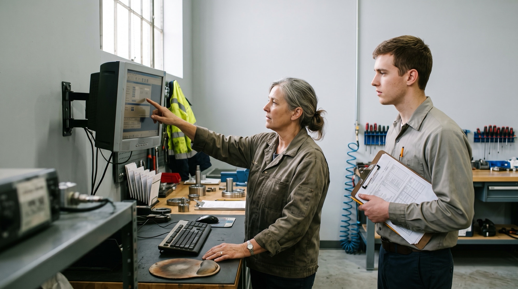
Design order and roadmap order are not the same list
A roadmap is ordered by what the business needs to be able to sell, renew or announce. Design work ordered the same way produces a product where each new thing is well made and the paths around it quietly decay. The two orderings genuinely conflict, and pretending they don't is how a design function turns into a queue of screens.
Design order is a cost-per-use ranking: how many people hit this, how often, and what it costs them each time they do. That puts a table nobody can filter and a setup step everyone performs once in very different positions from where the roadmap puts them. Neither ordering is wrong. They answer different questions, and only one of them has a date attached.
Run both lists and be explicit about the trade rather than resolving it quietly in a sprint planning session. The roadmap wins where there's a commitment behind it, a launch or a contract. Design order should win in the space between those, which is most of the year. When it never wins, what erodes is the ten-second path someone takes forty times a day, and that erosion arrives as support load rather than as a request you can prioritise.
The screen has to be honest about the data behind it
A B2B screen is a claim about somebody else's records, and the claim isn't always true. The sync ran four hours ago. The overnight import half-finished. The row exists and this person's role isn't allowed to see it. A product that renders all of those the same way teaches people to check it against a spreadsheet, and once an account starts keeping a second copy of your data they rarely stop.
So make the screen say which one it is. A number worth acting on carries the moment it was last true. An account whose connection stopped syncing overnight learns that on the screen where the decision gets made, not in a settings page nobody opens. And in a multi-tenant product, empty means two completely different things: there's nothing here yet, or there's something here your role can't see. Rendering both as a blank panel with the word None turns a permissions question into a bug report, and the bug report goes to support.
None of this is glamorous and all of it decides whether people trust the numbers enough to act on them without checking. That trust is the whole return on the interface.

A design system your engineers can actually build from
A design system isn't a component library. It's an agreement about which component wins when two of them could apply, and that agreement is what stops drift. Systems don't fall apart because a component is missing. They fall apart because two overlapping ones exist and nobody wrote down which situation each belongs to.
How much system you need depends on how far along the product is, and it's worth being blunt about the order. Motion comes last and gets built first almost every time, because it's the enjoyable part. Each of the duller layers has a moment when defining it is close to free, and a later moment when it means going back over everything already shipped.
Read the right-hand column first. The layer with the worst retrofit is the one to define now.
| Layer | What it covers | Cheapest point to define it | What retrofitting it costs |
|---|---|---|---|
| Tokens | Colour, type scale, spacing, radius and elevation, named once and used everywhere | Before the second screen gets built | A sweep across every screen already shipped, and a release where nothing new goes out |
| Core components | Buttons, inputs, selects, modals, tables, the twenty things every screen uses | During the first release | Finding every local variation before you can remove it, and nobody kept a list |
| State treatments | How empty, loading, stale, failed and permission-denied look and read everywhere | The first time a screen shows data from somewhere else | Support tickets first, then a pass over every screen that shipped without them |
| Component rules | The rule for choosing between two components that overlap, and the situations each one doesn't belong in | When a second team or an outside partner starts building | Two overlapping components for one job, and an argument every time either is touched |
| Responsive and density rules | What collapses, what stacks, what scrolls inside itself, down to 320 CSS pixels | Alongside the first data-heavy screen | Reworking the layouts carrying the most data, which are the ones people use most |
| Accessibility baseline | Contrast of at least 4.5 to 1 on body text, visible focus, keyboard order, target sizes | Before the first component ships, since it's mostly a token and markup decision | An audit, then a pass over every component, usually against a procurement deadline |
| Content and interface wording | What objects are called, empty-state and error wording, date and number formats | As soon as two people are writing interface text | Three names for the same object, and no safe way to change one of them |
A handover is finished when nobody has to guess
Implementation turns into a second round of design quietly. An engineer opens a ticket, the design doesn't say what a row does when a company name runs to ninety characters, so they truncate it somewhere sensible. It doesn't say what the save button does in the second before the server answers, so they disable it. Neither call is wrong. Neither one is written down either, and by the fourth ticket the product has a set of conventions nobody agreed to and nobody can find.
That costs you twice. Once when an engineer stops mid-ticket to make a decision a designer should have made, which is the slow half of most tickets and the half no estimate includes. Then again at review, when a designer sees the built version, disagrees with three of those calls, and the work reopens. The second cost is the one that sours the relationship between the two functions, because from either side the other one looks careless.
So the test worth holding a handover to is plain. Can an engineer who sat in none of the design reviews write the tickets from it and close them without asking a design question? If not, the design isn't finished, however finished it looks.
Run that as a real meeting before anything gets estimated. Every question they have to ask is a hole, and finding it in that room is cheap next to finding it in the third sprint. Here's what the package has to contain, in the order it's useful to read it.
1. The job, the user and how often they do it
Open each screen with who uses it, what they're trying to finish, and how many times a week they do it. That reads like preamble and it isn't. Half the decisions further down resolve differently for a task somebody runs between every meeting than for one they run twice a year at renewal, and an engineer who knows the frequency makes better calls in the gaps.
2. The flow, including every way in and out
Not only the path someone walks when everything goes right. Where they arrive from, including a deep link out of an email or a handoff from support. Where they can leave to, and what's saved when they do. What they see landing halfway through with the first half already done. A flow that starts at step one assumes nobody gets interrupted.
3. Every state each screen can be in, listed and counted
Write the states out per screen rather than leaving anyone to work out which exist: new and empty, loading, partly loaded, stale, failed, permission-denied, and the version carrying ten times more rows than the design showed. Counting them is the point. A state missing from a list you counted is visible in review. A state nobody listed gets found by a customer.
4. Where every value on the screen comes from
Trace each number, label and date back to the field behind it, with its format, its rounding, its maximum length and what renders when it's null. This is where the second round of design usually happens. An engineer with real data on screen and no instruction invents a truncation rule at four in the afternoon, and it spreads to every screen after.
5. Behaviour, not only appearance
What happens on click, on submit, and in the second and a half before the server answers. Which changes appear immediately and which wait to be confirmed. What the screen does when a write fails after it already looked like it worked. A static screen specifies the destination and leaves the trip to whoever builds it.
6. What the layout does as the window narrows
Name the widths and say what collapses, what stacks, what scrolls inside its own container, and what must never be hidden at any size. Take it down to 320 CSS pixels. That's the width the W3C's reflow criterion, WCAG 2.2 success criterion 1.4.10, requires content to work at without scrolling in two directions, and what a 1280 pixel window becomes at 400 percent zoom.
7. The component each element is, by name
Map every element to a named component in the system, with its variant and the tokens it uses, rather than to a picture of one. An engineer who can read the component name off the design builds from the library. One who can only see pixels rebuilds it locally, in good faith, and that's how a system forks without anyone deciding to.
8. Acceptance criteria somebody could actually check
Write the checks a person who sat out the design work could run. "Filter and sort survive a refresh." "A row with no assigned owner shows the unassigned treatment, not a blank cell." If a criterion can't be checked without forming an opinion, it's a design decision wearing a checkbox, and the build will settle it.
Worth knowing before you start
Ask your three heaviest accounts to send you the spreadsheet they keep next to your product. Almost every account has one, and every column in it is something your interface made them do somewhere else.
Count the clicks between logging in and the one thing this user does forty times a day. If it's more than two, that's the highest-value fix on your board.
A redesign of a screen your daily users already know has to be better by more than relearning it costs them. That's a higher bar than better, and most redesigns never get held to it.
Count how many of last quarter's tickets were reopened for something visual rather than something broken. Nobody measures handover quality on purpose, and that number is the closest thing to it you already have.
Related work
Further reading
Common questions
Yes. Where one exists we extend it rather than replace it, because a rebuild throws away conventions your users already learned. Where it has drifted into overlapping components, consolidating it is usually part of the work and it speeds up everything built afterwards.
Yes, though it changes the method. Support tickets, sales call recordings, session data and time with your own customer-facing team get you most of the way. It's weaker than talking to users directly, so we'd say so in the plan rather than present the findings with more confidence than they've earned.
It's where the screens live, which isn't the same thing. A file shows what the happy path looks like at one window width with plausible data in it. The parts that decide whether a ticket closes without a design decision are the state list, where each value comes from, the behaviour in the second before the server answers, and the acceptance criteria. Those get written next to the screens, not inside them.
Usually not. It means one interface with different defaults, different landing screens and different things hidden. Two full interfaces double the maintenance and tend to diverge, and the roles overlap more than the org chart suggests. We'd only split them when the jobs genuinely share nothing.
Related
Want to talk through your situation?
A short call is usually enough to tell whether this is the right work for you. If it isn’t, we’ll say so.