Website design & development · Field service & trades
Website design for field service and trades companies
The short answer
A field service website is a verification tool, not a brochure. On the first screen it has to confirm your coverage area, the equipment you actually service, your licence or registration numbers as readable text, and a phone number that dials on tap. Everything below that exists for the buyer who's still comparing.
Your buyer is standing next to the problem, on a phone, with your site and two competitors open. Whatever they can't confirm quickly they'll assume the worst about, then dial the next number. Below is the order we'd fix that in, and most of it you can do without us.

The first five seconds, on a phone, with one hand
Not the hero image. Four facts. Where you work, what you work on, who you're registered with, and how to reach you right now.
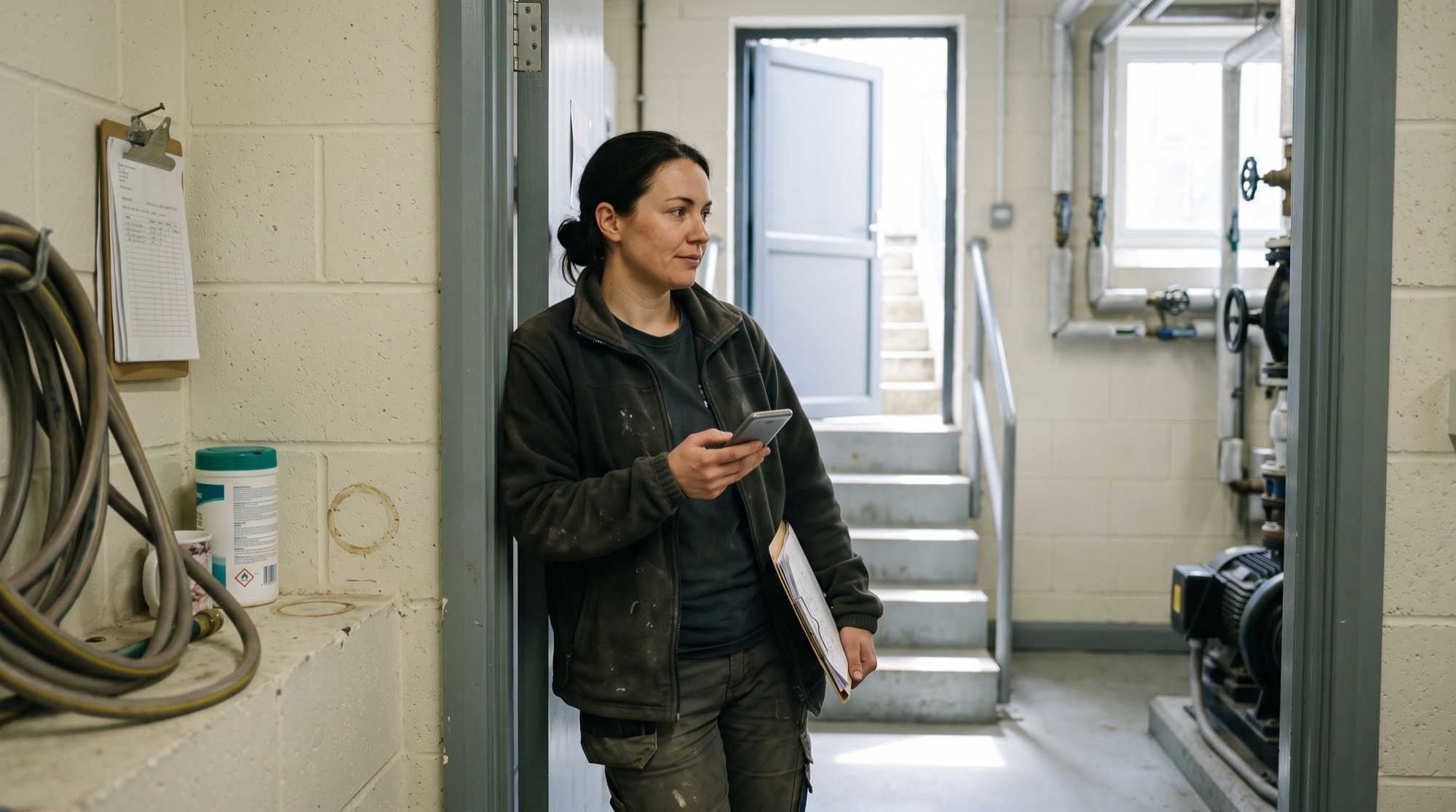
Picture where the page actually gets opened. A plant room with one bar of signal, a rooftop in February, a basement beside a compressor making a noise it shouldn't make. One hand is holding the phone. The other is holding a flashlight, or a panel cover, or a lid. Nobody in that position is reading your process explanation.
The practical version is unglamorous. Plain nouns and working links rather than graphics: the towns spelled out, the equipment named the way it's named on the nameplate, and a number that behaves as a link instead of text somebody has to select and copy.
Size the tap targets for a cold hand rather than a mouse. WCAG 2.2, the accessibility standard most of the web is built against, puts the floor at 24 by 24 CSS pixels at its AA level and 44 by 44 at its strictest. On a trades site, use the bigger number.
Almost every trades site already has all four facts on it somewhere. The problem is where they sit relative to the thumb.
Fix it in this order
You don't need a rebuild to close most of that gap. Six changes will do it, and the order runs from the one you can make this afternoon to the one that needs a decision about what the page is for.
Do the cheap ones first, because how much they move tells you how much of the problem was placement rather than the site itself. Every step has a check attached, and if you can't run the check, the step isn't finished.
1. Make the phone number a link
Wrap it in a tel link so one tap dials, then repeat it in a bar that stays on screen as the page scrolls. This is an afternoon of work on any platform and it moves more than anything else on this list. The check: open your site on your own phone, tap the number once, and watch the dialler open with the digits already in it.
2. Move the four facts above the fold
Coverage, equipment, credentials and contact, all visible on a phone before anybody scrolls. Push the hero photo down, or drop it entirely. Nothing else competes for that space, the tagline included. The check: screenshot the homepage on a phone and crop it at the bottom of the first screen. Anything missing from that crop is missing, whatever the desktop version looks like.
3. Turn your licence numbers into text
If the number lives inside a footer logo image, it isn't doing its job. Retype it as plain selectable text near the contact details, with the registration and account numbers a commercial buyer asks for beside it. The check: open the page on a phone, press and hold on the number, and confirm you can copy it. If you can't, neither can the person verifying you.
4. Write the after-hours line
Two sentences saying whether you take calls outside business hours, which number to use, and when somebody answers if you don't. It belongs beside the phone number, not on a contact page. The check: read it back at nine on a Tuesday night and ask whether a stranger would know what happens next. Saying nothing reads as closed until Monday.
5. Cut the weight out of the homepage
Almost always the same cause, a gallery of full-resolution job photos loading before anything else. Compress them, size them for a phone screen, and let the ones below the fold wait until somebody scrolls. The check: run the homepage through Google's PageSpeed Insights on the mobile tab. Google's published bar for a good Largest Contentful Paint is 2.5 seconds or less, at the 75th percentile of real page loads.
6. Separate the urgent path from the quote path
The emergency buyer gets the number and nothing else in the way. The contract buyer gets a short form underneath it, labelled as a quote request, asking about the building, the equipment and the timeline. One page, two paths, in that order. The check: count the fields. If a facilities manager can't finish it in a minute, it's a barrier rather than an intake.
Make your numbers checkable, not decorative
If you're a Licensed Electrical Contractor in Ontario, the Electrical Safety Authority requires your ECRA/ESA licence number on your website, alongside your correspondence, contracts, invoices and ads. Most sites satisfy that by baking the number into a footer logo image, which technically displays it and practically defeats it. That's ESA's rule and it's published, so confirm the current wording with them rather than with us.
The person reading that number is about to paste it into a search. So it should be selectable text, readable at phone size, sitting next to the other things being checked rather than three scrolls away from them. Same for a TSSA registration number, a WSIB account, proof of insurance, and the year you started.
The year is worth more than most operators think. Serving Peel and Halton since 1996 is a checkable claim. Over 30 years of experience is not, it ages badly, and it's the phrasing a three-year-old business uses when it's quietly counting the owner's whole career. Pick the version somebody could disprove.

Polish is not the thing being judged
The instinct before a rebuild is to make the site look more impressive. On a trades site that's usually the wrong lever, because the person standing next to the dead compressor isn't scoring your design. They're working out whether you're a real company that will really show up.
The things that read as fake are specific, and they're all cheap to fix. Stock photography of models in clean hard hats. A hero shot of a truck that isn't yours. Testimonials with a first name and no company attached. An experience claim with no start year. A gallery where every job could have been done anywhere, by anyone, at any time.
What reads as real is duller and much harder to fake. The equipment brands you're actually certified on, named. A photo of a unit you serviced with the model plate legible in it. The name of the person who answers the phone. A line saying which two towns you reach fastest and which one adds an hour. Specificity is the signal, because a business that isn't real can't produce it.
Spend the money on structure and on photographing your own work rather than on another round of visual refinement.
The phone path and the quote path are different pages of the same site
For an emergency call, a form is the worse option and your phone log usually proves it. Somebody with a failing compressor isn't going to type. Give them the number and get out of the way.
For a contract buyer the reverse holds. They don't want a call. They want to send a scope to three companies and compare what comes back, which needs a form and an acknowledgement rather than a number.
One form can't serve both, and trying is how most trades sites end up serving neither. The fields that make a quote request worth reading are the same fields that make an emergency form unusable, so every one you add costs you a submission from one buyer and saves you a phone call with the other. Carry both paths on the page instead, in that order.
| What the buyer is trying to do | What most trades sites give them | What it has to be |
|---|---|---|
| Dial you without typing anything | A number as plain text, to be selected and copied, or a contact form instead of a number | A tap-to-call link in the first screenful, repeated in a bar that stays put as the page scrolls |
| Find out whether coming out costs anything | Nothing on the site at all | Stated wherever the call-out is offered, even when the honest answer is that it depends on the job |
| Send a scope without a phone call | The same general contact form the emergency buyer gets | A quote request under the phone number, asking about the building, the equipment and the timeline |
| Attach the nameplate photo they already took | No upload, so they retype what the photo already says or give up on the detail | A file upload on the quote form that takes a photo or a scope document |
| Know what happens after they hit send | A page that says thank you | A named person, a stated turnaround, and the number to call if it turns urgent before then |
Speed, measured on the worst connection you have
Test the site from the truck, in a parking garage, on a client's guest wifi. That's where it actually gets loaded, and it is nothing like the connection it was signed off on.
The photo gallery is the usual culprit. The second cause is the one nobody goes looking for, which is the pile of third-party scripts a site collects over a few years. A chat widget nobody staffs, two analytics tags doing the same job, a tracking pixel from a campaign that ended two years ago. Each one is another request on a weak signal, and deleting the ones nobody can name a use for takes a morning.
The reason to care isn't a score in a testing tool. It's that a page which stalls on a weak signal has already lost to the competitor whose page didn't, and neither buyer will ever tell you that's why.
Build it so your own staff can keep it current
A trades site goes stale in three specific places. The coverage list, the after-hours notice, and the last few jobs. Those are the things most builds leave locked behind whoever wrote the code.
Treat that as a build requirement rather than a training problem. Whoever handles your scheduling and your phones should be able to post a finished job, edit the coverage list, and change the after-hours message during a heat wave, in a few minutes, from a phone if it's a Saturday. If any of it needs an email to the firm that built the site, it won't happen.
A real handoff is smaller than it sounds and it isn't a document. Two or three named tasks, one named person, and that person doing each of them once, live, on their own login, before the project closes.
We've built one of these on Webflow before, for First Refrigeration, and the platform was the least interesting decision in it.
Worth knowing before you start
Try your own site one-handed, with a work glove on the hand holding the phone. If you can't reach the number with that thumb, neither can the person standing beside a dead compressor, and they have somewhere else to tap.
Name equipment the way your customer names it, not the way your invoice does. Somebody searching for a walk-in cooler that isn't cooling is not searching for commercial refrigeration systems maintenance.
Ask your office to forward you the last ten quote requests that came in through the site. If most of them are missing the equipment or the address, the form is asking the wrong questions, and your team is paying for that in phone calls.
Delete the budget field from your contact form. On an emergency job it's unanswerable, and on a contract job it's the question that makes a facilities manager close the tab and send the scope somewhere else.
Related work
Further reading
Common questions
Both, and it's the same form. Put it on the homepage under the phone number, because the emergency buyer never scrolls that far and it costs them nothing. Give it its own URL too, so your sales side can send that link in an email or print it on a card. What doesn't work is only the separate page, because the contract buyer who landed on the homepage has to take a second tap on faith.
Only where the coverage is genuinely different, which is rarer than the advice suggests. The honest test is whether you can write three things about working in that town that aren't true of the next one. A second depot, a shorter response window, equipment you only service there. If you can't, you're building twenty pages that say the same thing with the name swapped, and twenty pages nobody will keep current. One coverage page a buyer believes beats twenty of them.
Less than you'd expect, and the narrowness is the point. Scope it to the two or three things that genuinely go stale and the handover sticks, because your people learn a few named tasks rather than a content system. Open the whole site up instead and nobody learns any of it, which is how a site ends up back with whoever built it for a wording change.
Publish the version that's true this week, and make sure somebody in your office can change it in under a minute. Plenty of contractors answer any hour through the heating season and next morning in July, or answer any hour for maintenance-contract customers and next morning for everybody else. Both are fine to say out loud. What costs you work is a line written in March and still up in December, because the person who calls it and gets nothing does not call back.
For planned work, often. Seasonal tune-ups and scheduled maintenance are genuinely bookable because you control the slot. Emergency dispatch isn't, because availability depends on who's free and where they already are. Offering booking on work you can't reliably schedule creates a promise you then have to walk back by phone.
Ask in writing, and ask on site while the technician is still there rather than a month later by email. Commercial clients usually agree to equipment and mechanical room shots and decline anything identifying the tenant or the address. Building the habit of asking is worth more than any single photo shoot.
Related
Want to talk through your situation?
A short call is usually enough to tell whether this is the right work for you. If it isn’t, we’ll say so.