Branding · Field service & trades
Branding for HVAC, refrigeration and electrical companies
The short answer
In trades, a brand is a legitimacy signal rather than a positioning exercise. The mark gets judged as a vinyl cut on a moving van, a one-colour stamp on an invoice, and an embroidered patch on a uniform. If it only works on a screen, it fails in every place your customer actually sees it.
Your van says one thing, your invoice says another, and the quote you emailed last week carries a logo from two versions ago. Nobody is confused by it exactly. They just read you as smaller and newer than you are.
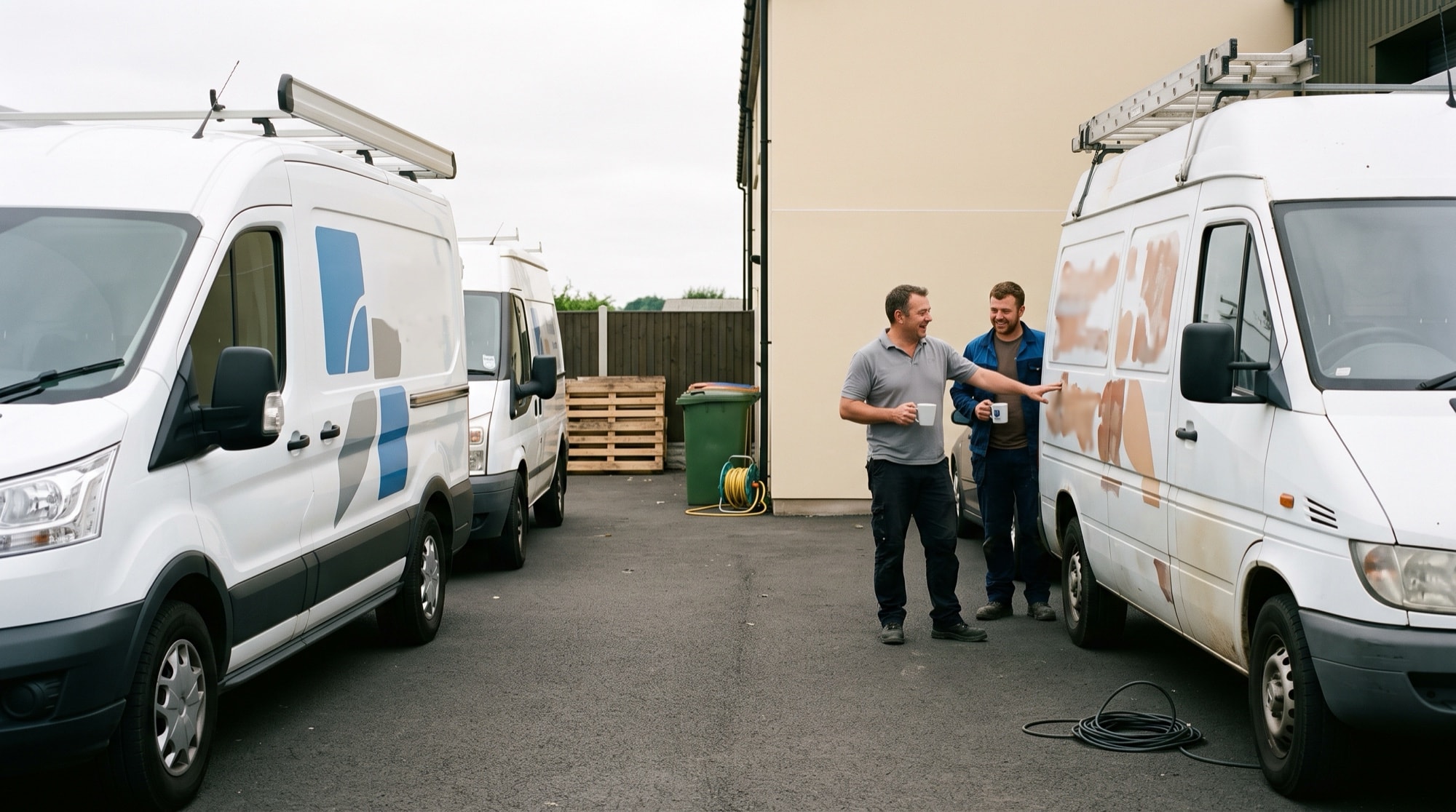
The van is the primary application, and the hardest one
Most logos get designed on a screen and then discovered to be unprintable on a vehicle. A mark with four colours, a gradient, a hairline outline and small text under it becomes a blurry sticker on a white van and an invisible one on a dark truck.
The constraints are real and worth designing against from the first sketch. It has to read at distance and at speed, from the side and from the back, usually on a vehicle moving away from the person reading it. It needs a version that holds up on a light wrap and one that holds up on a dark one. And it has to survive a panel interrupted by a door handle, a window line or a rear light cluster.
Design for the van first and the screen version comes free. Do it the other way round and you pay for a second round of artwork.
Four machines will remake your mark, and each one has a floor
Your logo isn't reproduced by a designer. It's reproduced by machines, and a trades business usually has four of them.
A vinyl plotter cuts the shape out of coloured film and somebody weeds the waste away by hand, so every thin stroke and enclosed counter is a piece someone picks out with a knife. An embroidery machine builds the mark from stitches at a fixed pitch, and below a certain letter height the stitches close up and a word turns into a smudge. A print shop running your quote is often working in one colour on ordinary stock, so anything that needed a second colour to be legible stops being legible. And the equipment tag gets stamped small, in one pass, onto a plate where nothing can be redrawn afterwards.
Each has a floor, meaning the smallest detail it can physically hold, and the machine sets that floor rather than whoever drew the mark. Design above the lowest one. Otherwise you don't have a system, you have a mark quietly redrawn by four suppliers who never spoke to each other.

The Ontario constraint that changes the layout
If you're a Licensed Electrical Contractor, the Electrical Safety Authority requires your ECRA/ESA licence number on your business vehicle, and it publishes the spec. At least one inch high, in black or white lettering, prefaced with ECRA/ESA Lic or ECRA/ESA, on the back or both sides of the truck, displayed within 90 days of receiving the licence. Confirm the current wording with ESA before a wrap is cut. It's their rule, it's published, and it isn't ours to restate forever.
What that does to the design is give the vehicle layout a fixed element that isn't yours to style. Plan the space for it, and note the lettering has to be black or white. Your panel colour therefore has to hold black or white text at that size, which quietly rules out a few mid-tones that look excellent everywhere else. Treat the number as an afterthought and the wrap shop makes that call for you.
The same logic applies to fuels work. If a TSSA registration number is what makes you legal to do the job, it belongs in the paperwork template rather than being typed in by hand each time.
The name on the van has to match the name in the registry
This is the failure nobody catches until it costs a contract.
The van says one trading name. The TSSA registration sits under a numbered company. The WSIB account is under a third name left over from a partnership that ended years ago. A buyer who does exactly the right thing, which is search the public registry before hiring you, finds nothing, and the safest conclusion available to them is that you aren't registered at all.
Sorting this out isn't a design task, but a branding engagement is when it surfaces, because that's the moment somebody finally goes looking. The output is boring and valuable. One trading name used consistently, and a stated relationship to the legal name printed on the site and the invoice, so the two reconcile at a glance.
The quote document is the surface that gets forwarded
On residential work the quote goes to the person who called you and stops there. On anything commercial it doesn't. It gets forwarded to whoever approves the spend, and that person never met your technician, never saw the van, and is reading your PDF next to two others.
So the quote and the invoice are brand surfaces, and they're the two almost nobody designs. What belongs on them is unglamorous. Both names reconciled, so an accounts department can raise a purchase order against the right entity without phoning to ask. The licence line as text, where it's expected rather than buried under the footer. A scope saying what's included and what isn't. A date the quote is good until.
Build it once as a template instead of rebuilding it per job. A template is what makes your third quote look like your first, and consistency across three documents is most of what a facilities manager means when they say a contractor seems organised. It's also the cheapest surface here to change, which is why it changes first and the vehicles change last.

Where the system has to reach
A trades brand that stops at a logo file hasn't finished. The places it has to reach are the places a customer actually encounters you, and most of them are paper or fabric rather than pixels.
The one operators underestimate is the equipment tag left after a service. It gets read by whoever is standing in the mechanical room when the unit fails again, which may be years later and may not be the person who hired you.
First Refrigeration is the version of that we've built. Strong reds and clean typography, applied across service vehicles, uniforms and on-the-job visibility rather than stopping at a logo file. The owner's own summary was that we gave them "excellent guidance on how to effectively enhance our small business's identity," which is an accurate description of what this work is.
The test for whether the system is finished isn't how many files are in the folder. It's whether a supplier you've never met, working from those files alone, produces something you'd be happy to see parked outside a client's building.
| Surface | What it has to prove | How often it changes | What that means for the artwork |
|---|---|---|---|
| Vehicle | You're established and already work around here | Rarely. The graphics outlive the decision by years | One-colour cut version, plus light-panel and dark-panel versions |
| Uniform or work shirt | The person at the door belongs to the company that was booked | On the reorder cycle, once or twice a year | Stitch version kept above the embroiderer's floor, thread specified as spools |
| Quote document | You're registered and quote the way you'll invoice | Any time. It's a template you control | Print-safe one-colour mark, both names reconciled, licence line as text |
| Invoice | The entity being paid did the work | Any time. Same template family as the quote | As the quote, plus the numbers a payer's accounts team checks |
| Equipment tag left after service | Somebody competent was here and can be called back | Set at print, then it sits for years | The smallest reproduction in the system. Mark and phone number only |
| Jobsite sign or door hanger | Work is happening here and this is who's doing it | Per season or per campaign | Readable from the street, one colour, on stock you reprint cheaply |
The order that stops you paying for the fleet twice
Most of the cost in a trades rebrand isn't the design. It's the application, spread across suppliers who each want a different file and each have their own lead time. Run it in the wrong order and you buy the same surface twice.
This sequence settles the constraining decisions first and leaves the vinyl until last.
1. Reconcile the names before anything gets drawn
Settle which trading name goes on everything, and write down how it relates to the legal name on the registries, the insurance certificate and the bank account. An afternoon, no designer. Skipping it is how you get a good mark above a name a buyer can't find.
2. Collect the supplier specs while the design is still open
Email your wrap shop, your embroiderer, your print shop and your sign maker. Ask what file formats and colour systems they work in, and what their minimum reproduction size is. Four emails become constraints the designer works inside, rather than surprises arriving after approval.
3. Design in one colour, at the smallest size it has to survive
Start with a single-colour version at the size of an embroidered chest patch. If it holds together there, it holds on a van across a parking lot and on a stamped tag. Colour comes after. The other order gives you a mark that looks best where nobody sees it.
4. Prove it physically before you sign anything off
Ask for a small vinyl sample, an embroidery stitch-out, and the quote template printed on the stock your office uses. Look at all three under the light where the work happens, a mechanical room or a lot at dusk. Approving from a screen is how a colour goes muddy on four vehicles.
5. Change the free surfaces the same week
Quote and invoice templates, email signature, profile images, the voicemail greeting if it names an older version of the business. None of these need a supplier, a lead time or a budget line. Doing them now puts the new name in circulation before the first vehicle comes off the road.
6. Take the vehicles on their own cycle, whole ones at a time
Work through the fleet in the order the vehicles are due for new graphics anyway, and finish each one completely before starting the next. A half-updated fleet is what costs you, because four vans carrying two identities read as two companies. If you can only do part, do the core area.
7. Let uniforms and leave-behinds turn over naturally
Shirts, jackets, magnets, door hangers and equipment tags all get replaced on their own schedule, so let them, rather than binning usable stock to close the gap faster. The exception is anything carrying an old phone number or a superseded legal name. That isn't inconsistent any more, it's wrong.
What a rebrand won't do for you
It won't make you look bigger than the work behind it supports. A polished identity on a business with no recent job evidence and an unanswered phone reads as a marketing exercise, and the buyers who notice that are the buyers you want.
It also won't survive being applied halfway. Budget the application, not just the design. The application is a project with suppliers and lead times in it, and it's the half that slides into next season.
Start by counting the surfaces. Walk the yard, open the filing cabinet, look at the last quote you sent and the last shirt you bought. Most operators find more places their name appears than they expected, and that count shapes the plan more than any design choice will.
Worth knowing before you start
Print your logo at business-card size, in black and white, on an office printer, then look at it from arm's length. Anything that disappears there disappears on a van in traffic too, and you've learned it for the cost of a sheet of paper.
Ask whoever draws your mark for the editable source file, and keep a copy somewhere that isn't a supplier's computer. Businesses lose the ability to reproduce their own logo this way more often than you'd think, because the only master sat on a machine at a shop they stopped using.
Ask your wrap shop how long the film they'd use is warranted for. That number tells you how long you're committing to a panel, and it turns the rollout order into arithmetic instead of a guess.
Related work
Common questions
Often the second. If the mark is legible in one colour and at distance, and the real problem is that it's used four different ways across four touchpoints, that's a system and application project rather than a redesign. We'll tell you which one you're in before you commit to either.
Sometimes, partially. A vinyl shop can often replace or overlay panels instead of redoing a full wrap, and the difference is large enough to change the plan. Ask them before the design is final, because knowing which vehicles can be updated easily changes what a sensible rollout order looks like.
Less than most operators put there. The name, what you service in words a customer would use, one phone number, and any licence line you're required to display. A tagline is the first thing to go unreadable at distance, and a list of six services reads as none. If it wouldn't survive a two-second glance from another lane, it's taking room the phone number should have.
Close, but never identical, and it's better to know that now than later. Vinyl comes from a film range, thread comes from a spool range, and print mixes ink, so each supplier works in a different colour system. Specify the colour once per system rather than handing everyone a screen value, and expect the shirt to sit a shade off the van.
Vector artwork in the formats each of them asks for, a single-colour version, a reversed version for dark panels, and the colour specification in the system that supplier works in, which is not the same one your screen uses. Add templates for the quote and the invoice and you've covered every supplier a trades business normally hires.
Usually the opposite. The smaller the operation, the harder the buyer looks for evidence you're established, and consistent naming plus one legible mark on the van is the cheapest version of that evidence available. What would be overkill is a brand strategy exercise. Making the four places you appear agree with each other isn't.
Related
Want to talk through your situation?
A short call is usually enough to tell whether this is the right work for you. If it isn’t, we’ll say so.