Branding and UX design
People decide whether to trust you before they've read a word.
Brand identity and product design built as one system, so the site, the app, the proposal and the invoice all look like they came from the same company.
Brand identity
Logo, type, colour, the rules
Design system
Components and every state
Product UX
Flows and the screens between
Guidelines
So everyone chooses the same
What we build
Design that gets built, not design that gets presented.
Brand identity
Logo, type, colour and the rules for using them. Made to hold up at the size of a phone icon and on the side of a van, not just on a title slide.
Design systems
Components, states and tokens your developers build from, so the tenth screen stops being a fresh argument about spacing and the twentieth doesn't need one.
Product UX
Flows and screens for the work your users actually do, including the empty states, the errors and the parts that are boring to design and expensive to leave out.
Guidelines
One short document that settles the recurring questions, so a proposal from sales looks like the product it's selling and nobody rebuilds the deck template again.
How it works
Audit it, show it on real things, then write the rules.
Look at what's there
Everything carrying your name today, side by side. It's usually the first time anyone has seen it in one place, and it's where the disagreements surface.
Show directions on real things
Two or three directions applied to the screens and documents you actually use. Not a moodboard, because nobody can honestly judge a moodboard.
Build the system
Type scale, colour, spacing, components and their states, defined once and handed over in a form a developer can build from directly.
Roll it out and stay
We apply it, document it and stay available while your team learns it. A system nobody adopts is a PDF with a nice cover.
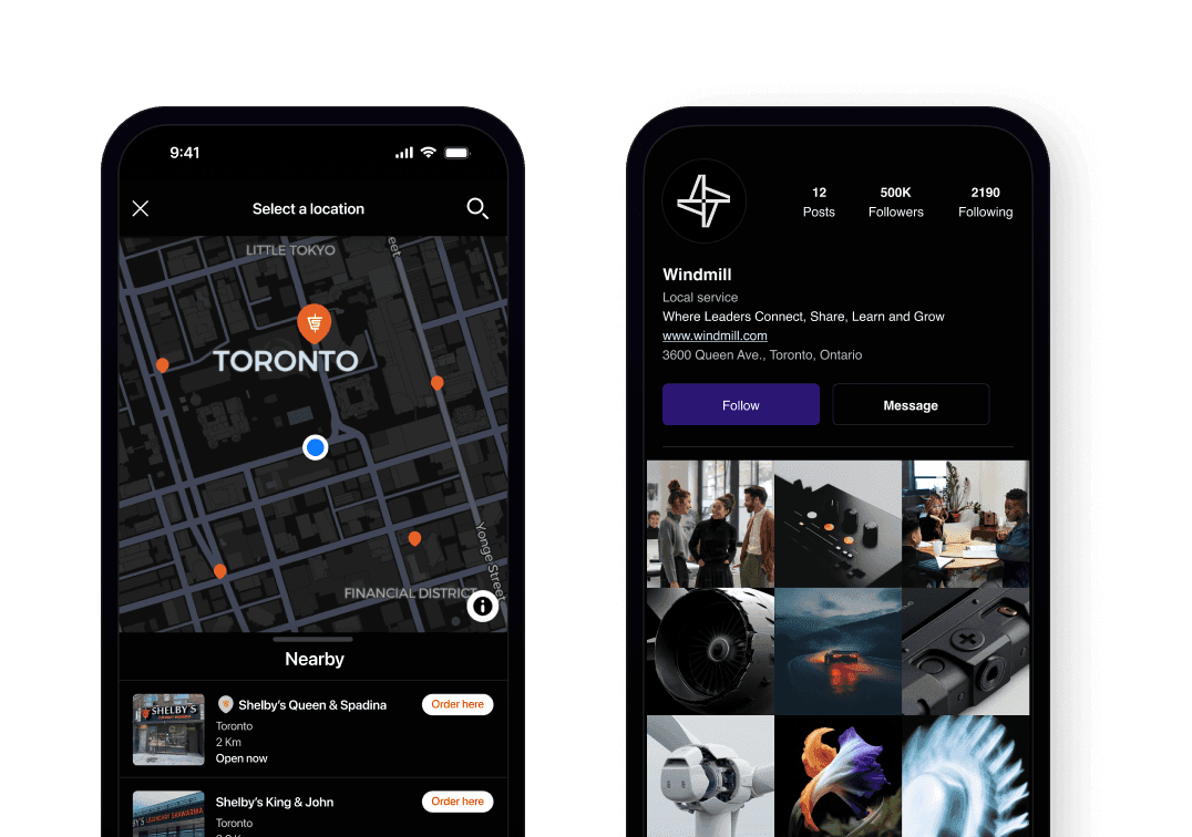
Two screens with nothing in common except the rules underneath.
A map for picking a location and a profile page do completely different jobs. What they share is a type scale, a spacing step, and buttons in the same states everywhere they appear. Decide that once and the twentieth screen stops being a fresh argument about padding. Skip it and every screen is a negotiation.
Being straight with you
When this isn't what you need.
The product doesn't exist yet
Settle the flows before the identity. Otherwise you're styling screens nobody has agreed should be there.
Product strategyYou need it built, not just designed
A design handed across a gap to a separate development team is where most of this work quietly dies. We'd rather do both.
Custom developmentIt's the website that looks dated
If the identity is fine and the site is the problem, a rebuild is the cheaper fix and you'll see it sooner.
Website design and developmentQuestions we get before the first call
The ones people ask once they trust you enough to ask them
Usually not. Most of the problem is inconsistency rather than the logo, and fixing the system costs less than starting over. We'll tell you which one you have before you commit to either.
Yes. Plenty of this work keeps the identity exactly as it is and builds the product design system around it, so the app finally matches the brochure.
The design lands in a shipped product, because the people building it sit in the same team. A handoff between a brand studio and a separate development shop is where the detail gets lost.
Components, tokens and states in a form they can build from directly, along with the flows those components sit in. Not a flat image of a design they have to reverse-engineer.
Early, and applied to your own screens rather than to a sample. That's the only version anyone can react to honestly.
Show us what you have. We'll show you what it could be.
A short call and a look at everything carrying your name today. You'll get the honest version of how consistent it currently is.